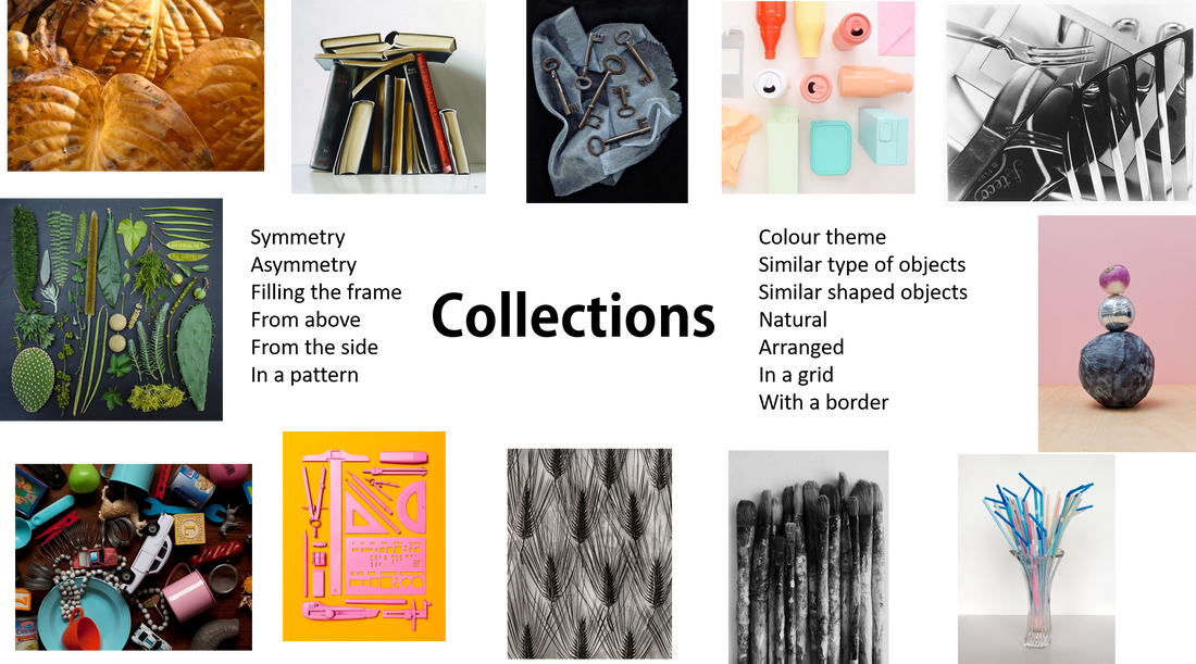
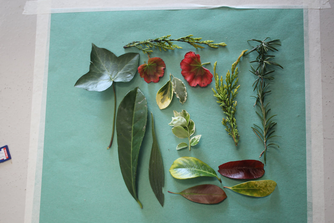
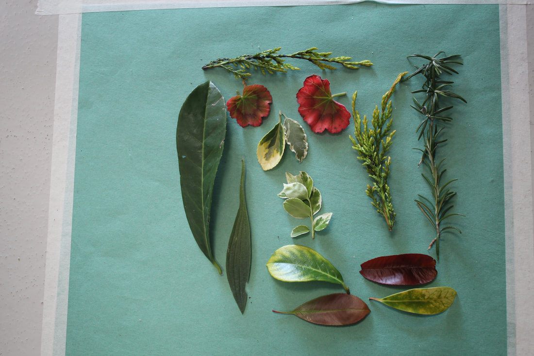
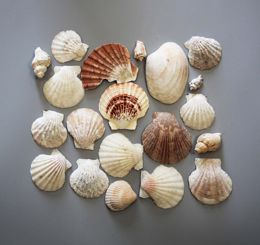
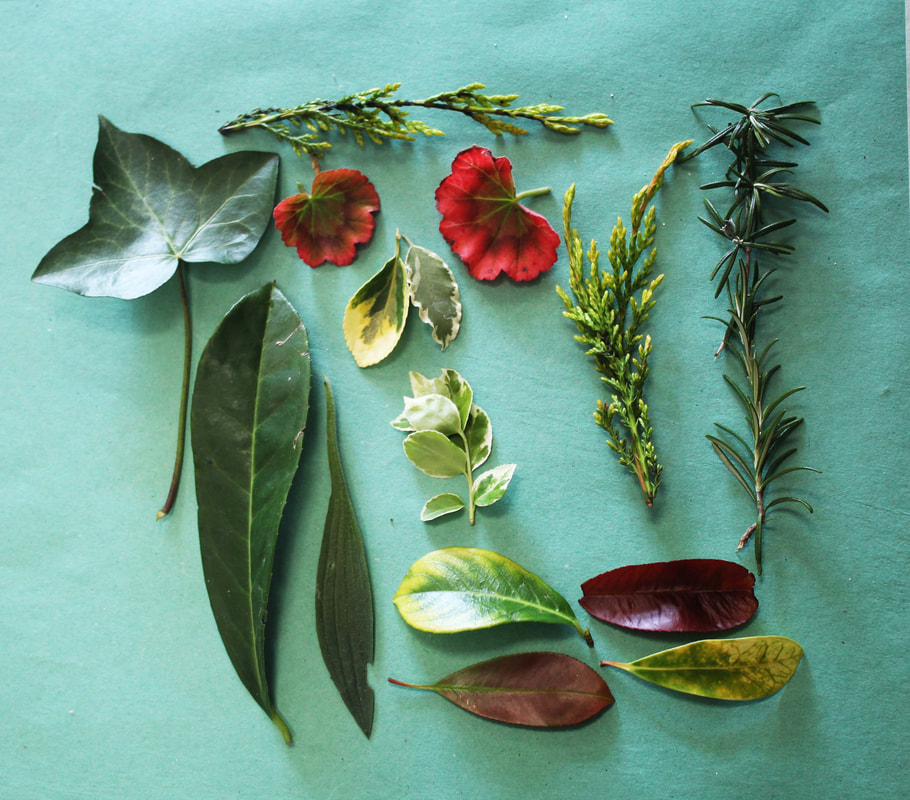
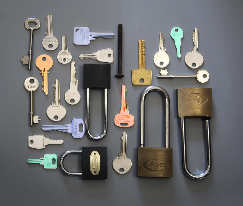
Objects with a theme
Refining my objects with a theme
|
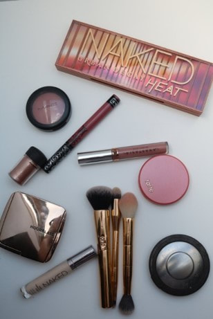
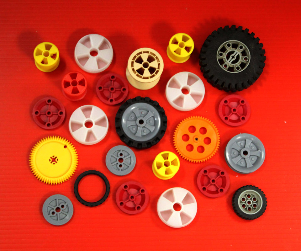
original
|
To edit this photo I have increased the saturation of colour and changed the overall colour temperature. This makes the whole image into the warm colour theme.To edit this photo I have increased the saturation of colour and changed the overall colour temperature. This makes the whole image into the warm colour theme.
|
|
|

|
|
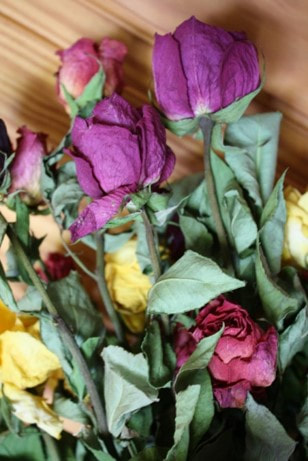
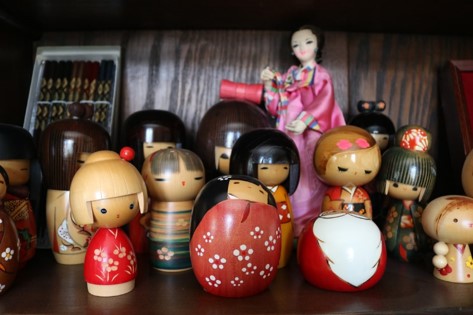
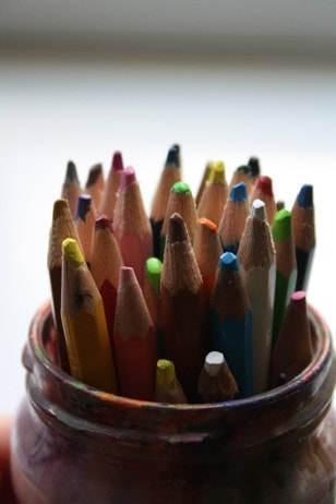
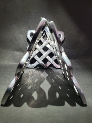
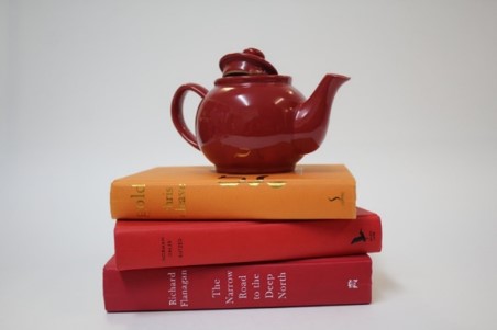
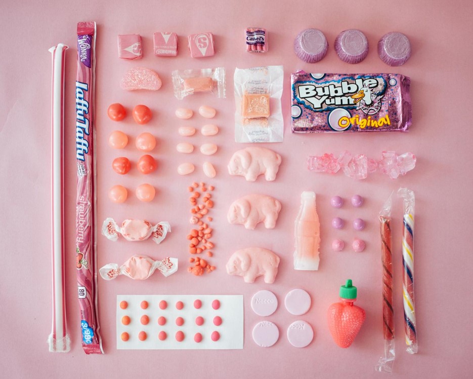
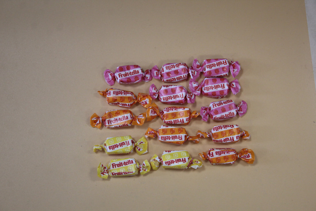
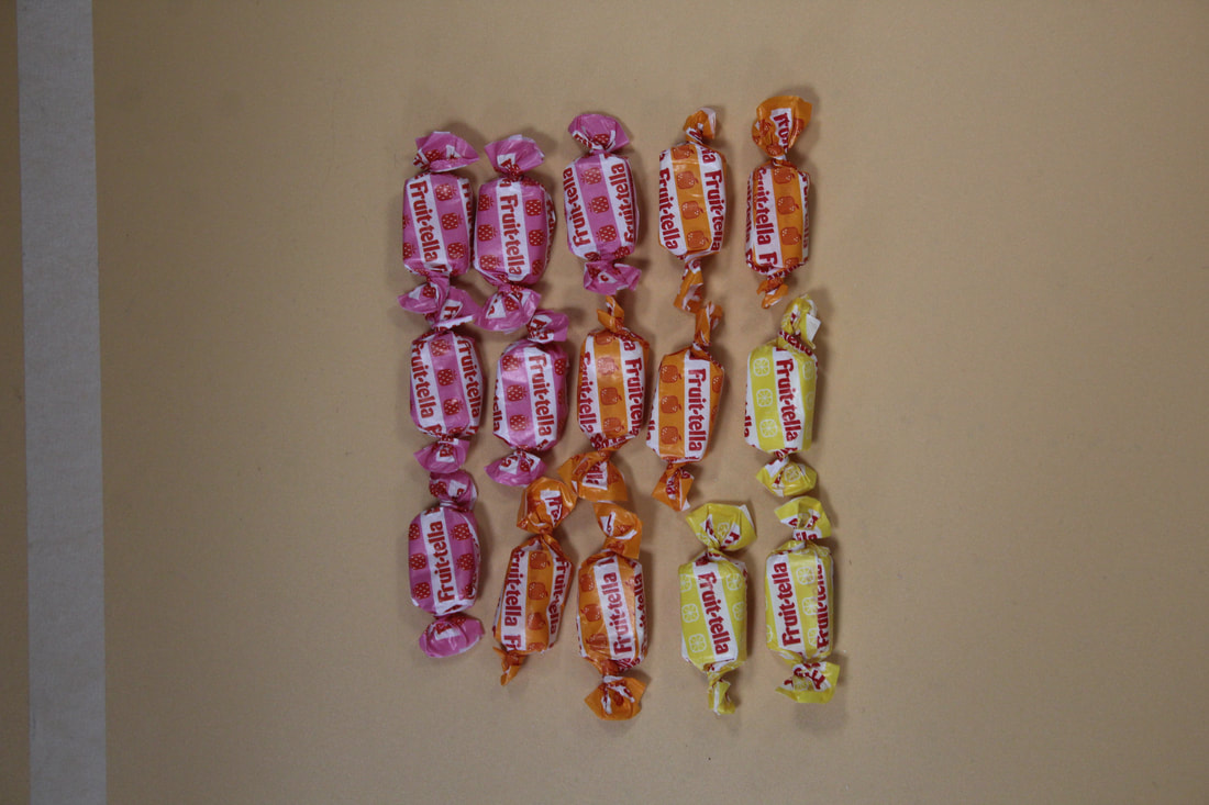
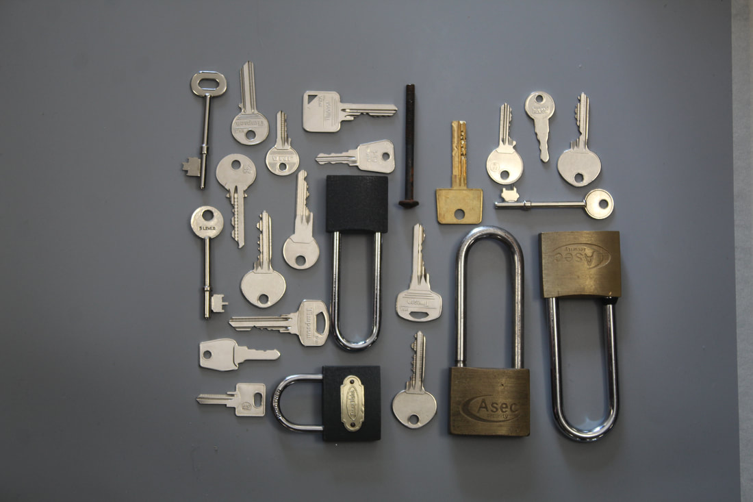
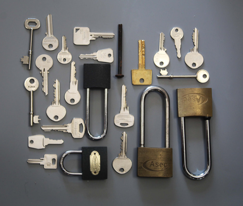
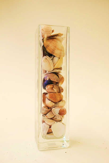
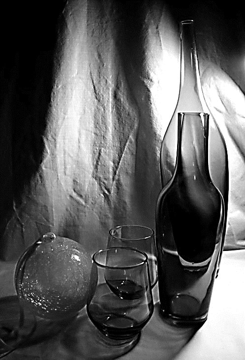
original
|
To edit this photo I have emphasized the light and dark areas by making the images monochrome and increasing the contrast. This has added definition to the shadows.
|
|
|
|
|
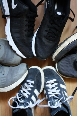
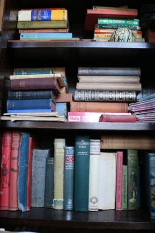
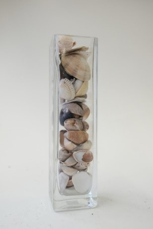
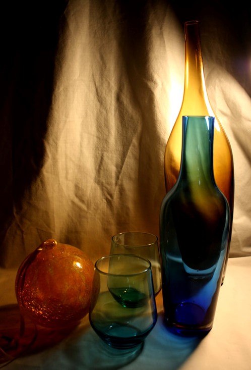
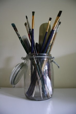
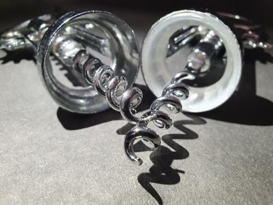
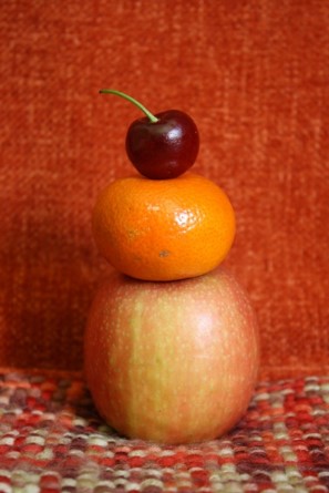
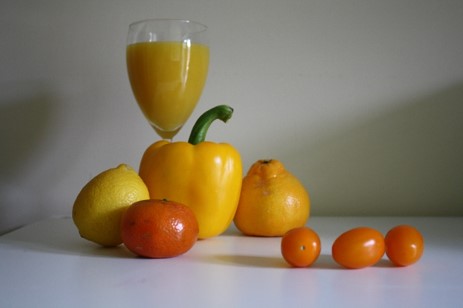
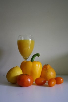
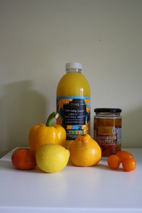
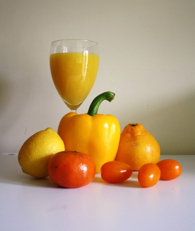
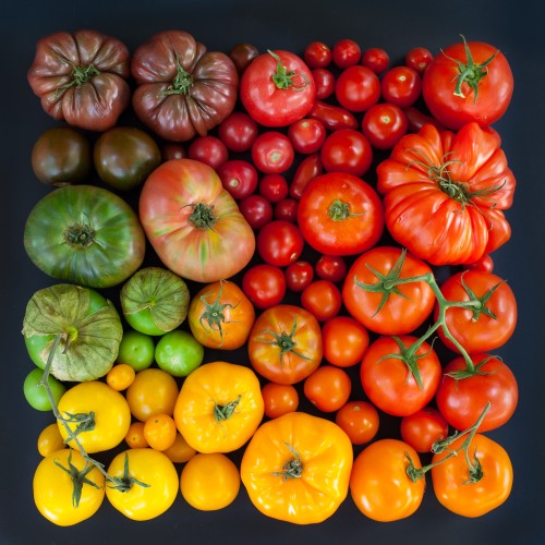
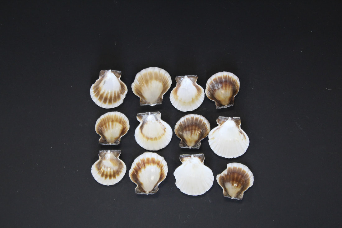
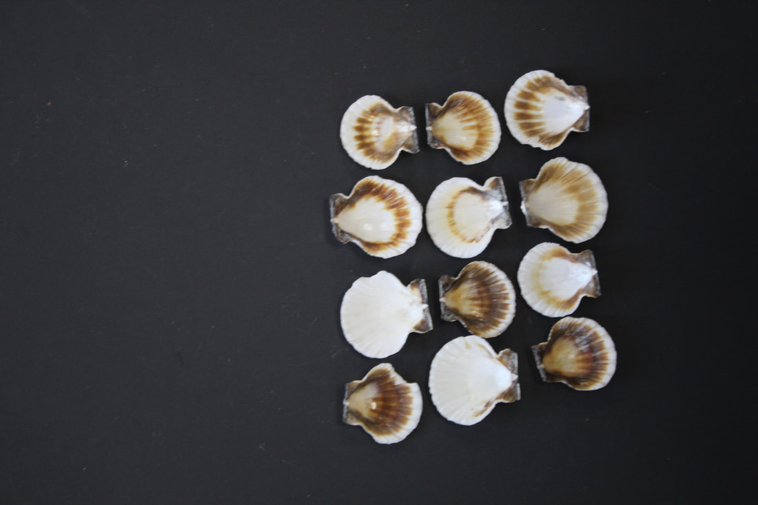
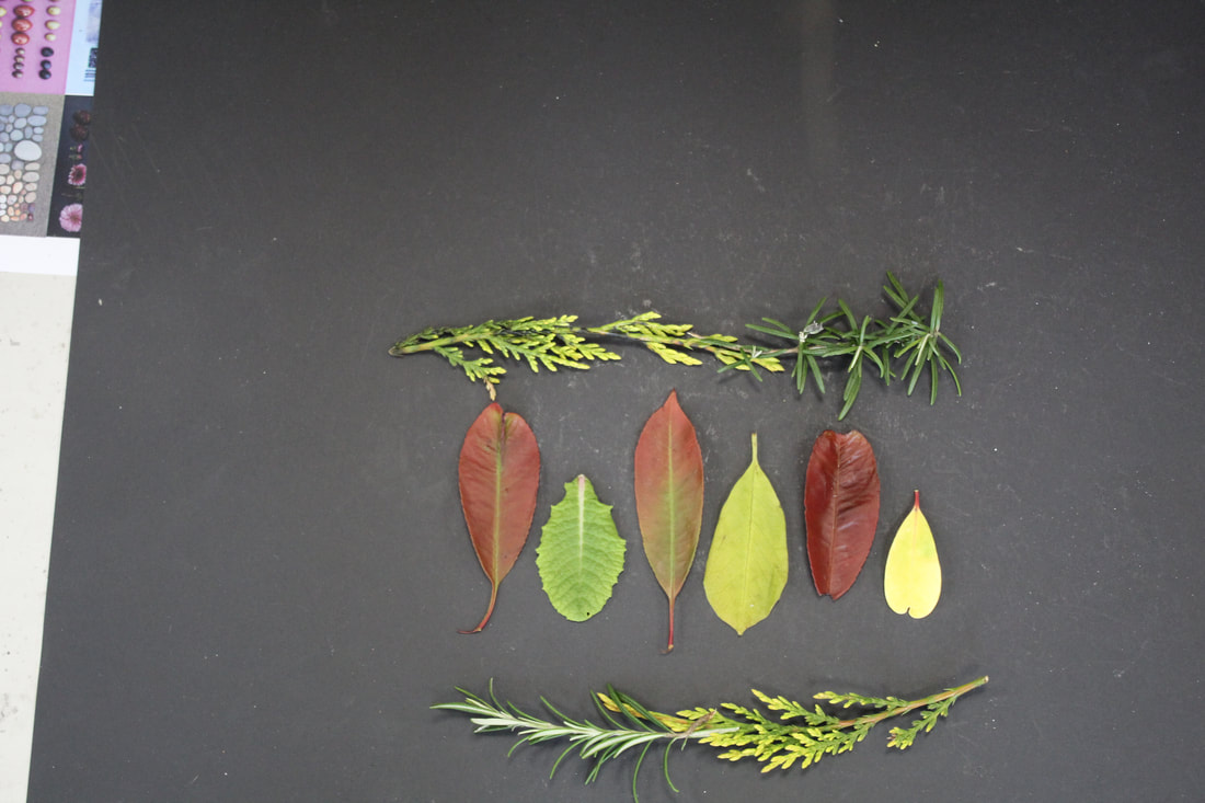
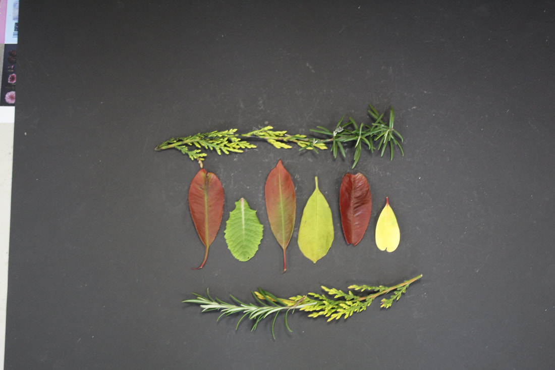
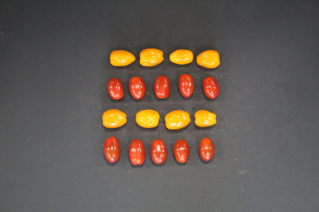
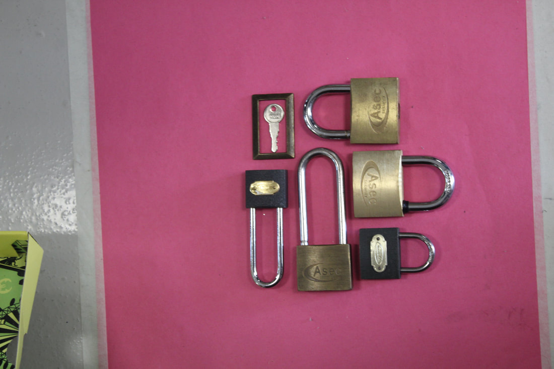
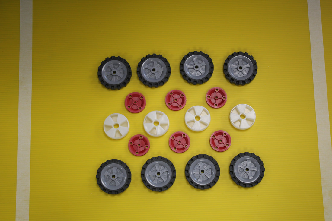
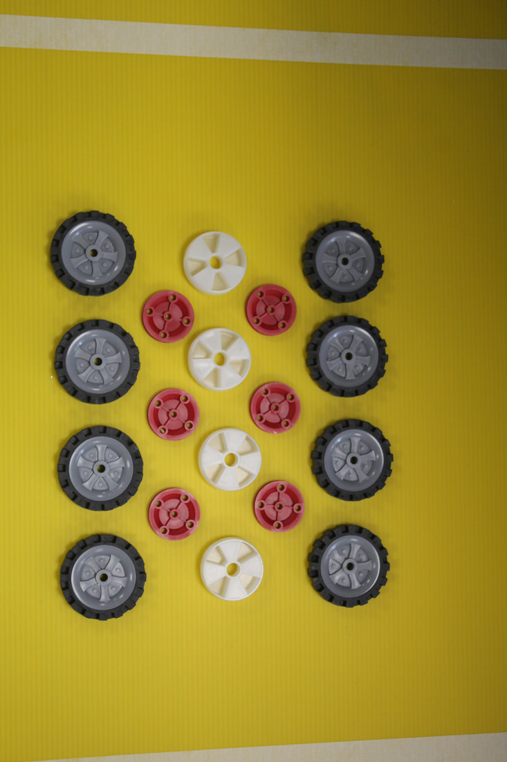
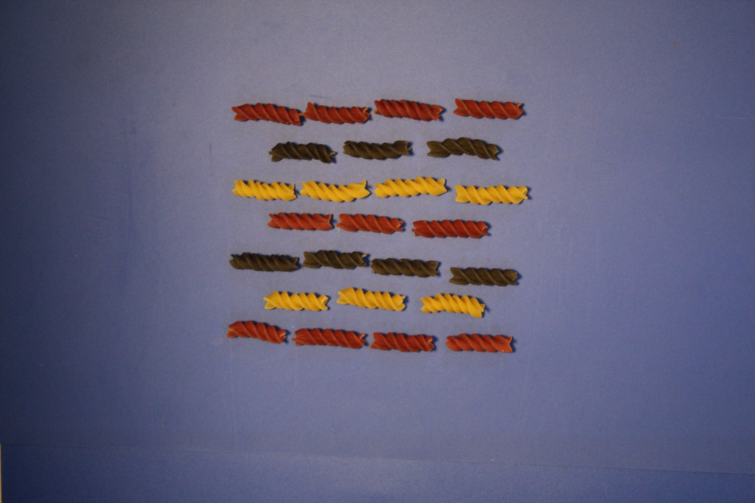
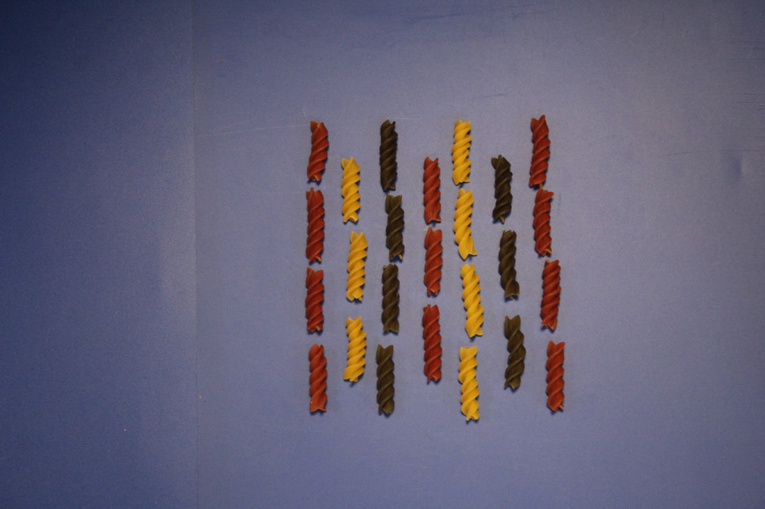
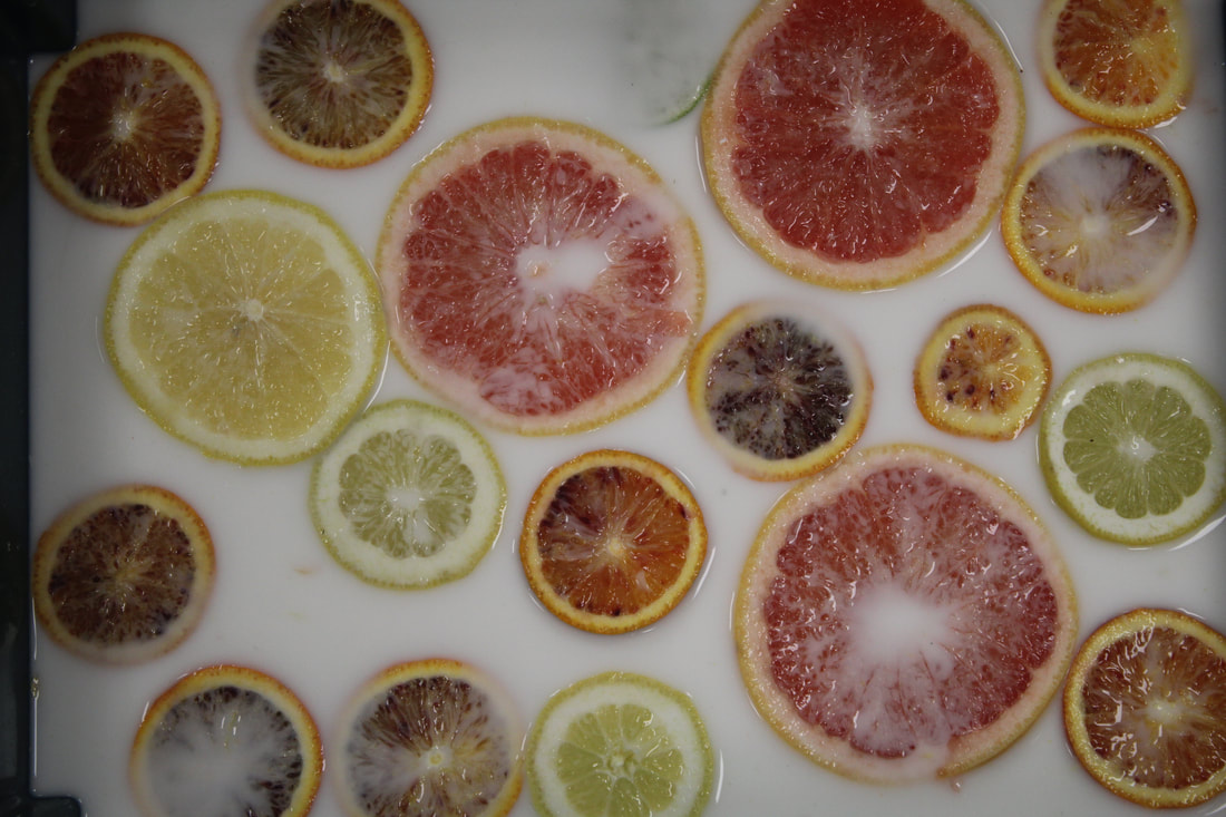
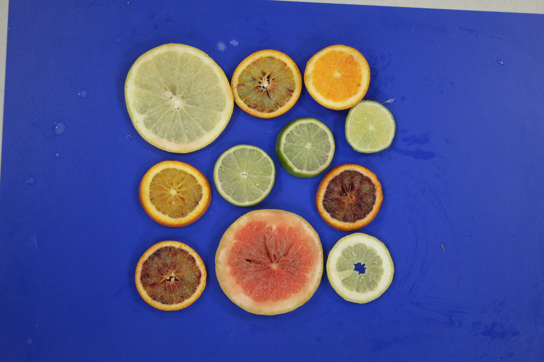
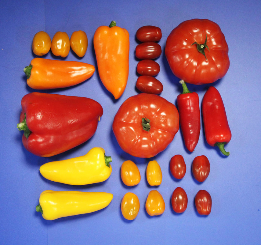
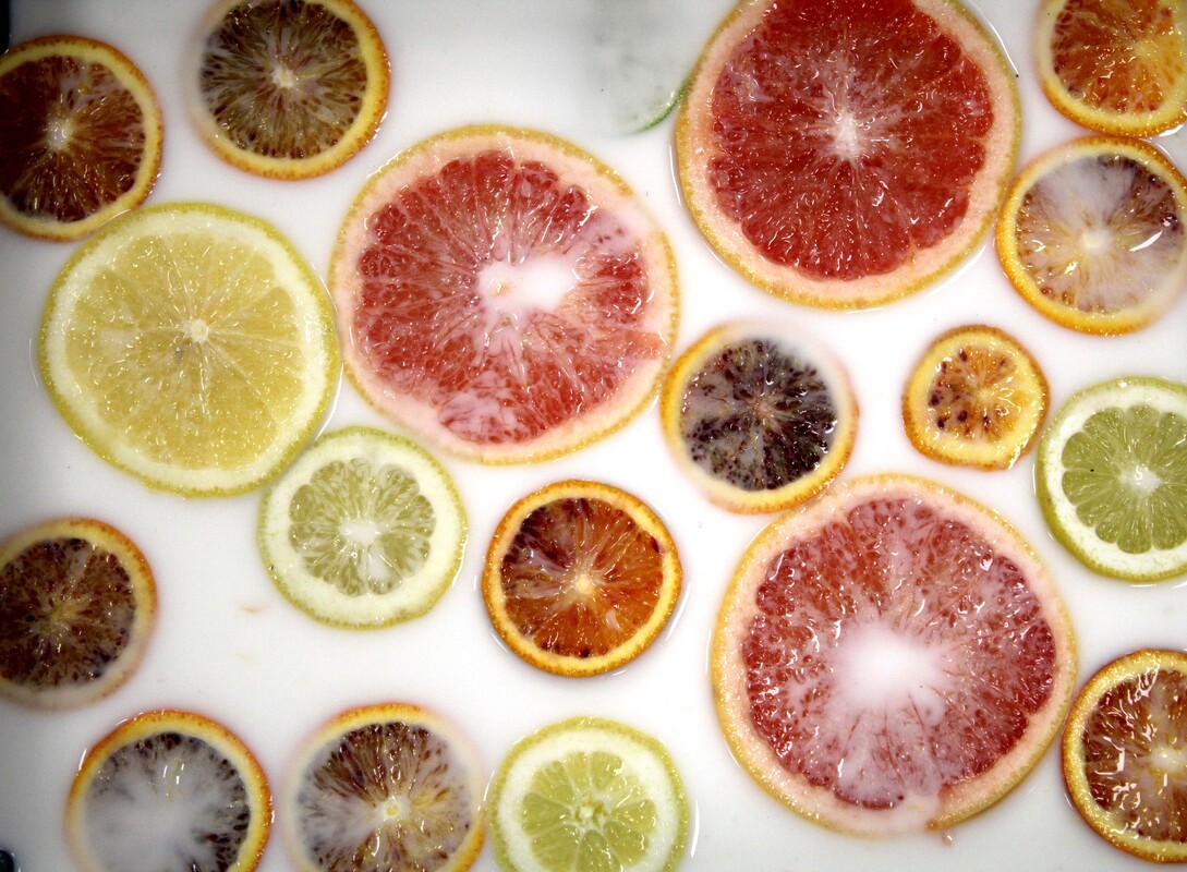
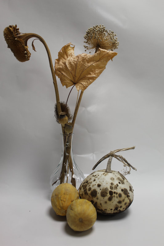
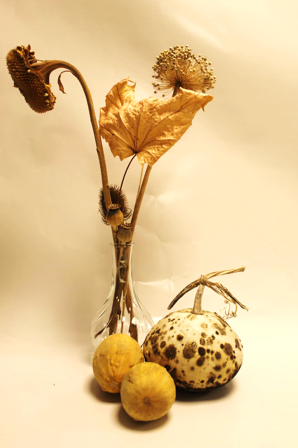
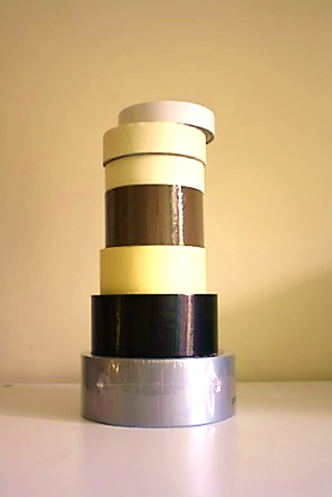
original
|
To edit this photo I have increased the contrast and saturation of colour making the photo warmer in tone.
|
|
|
|
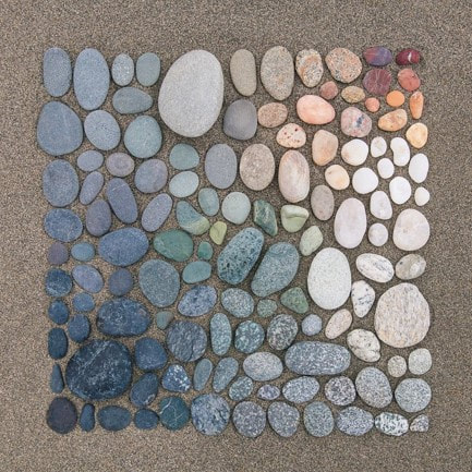
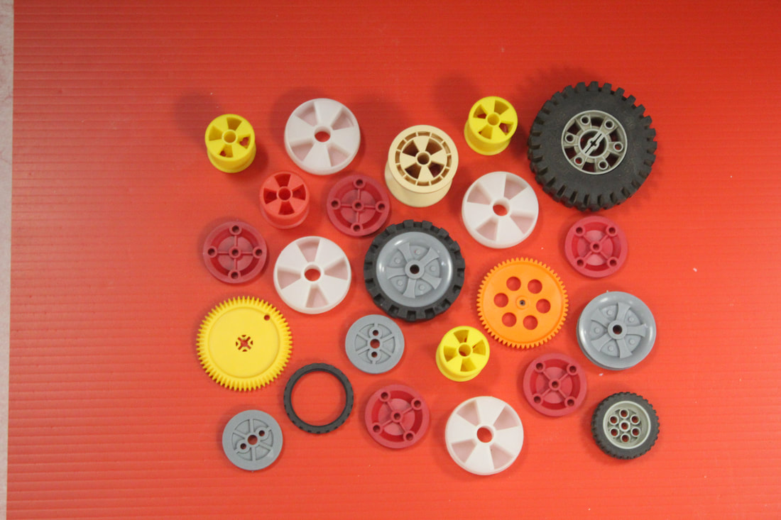
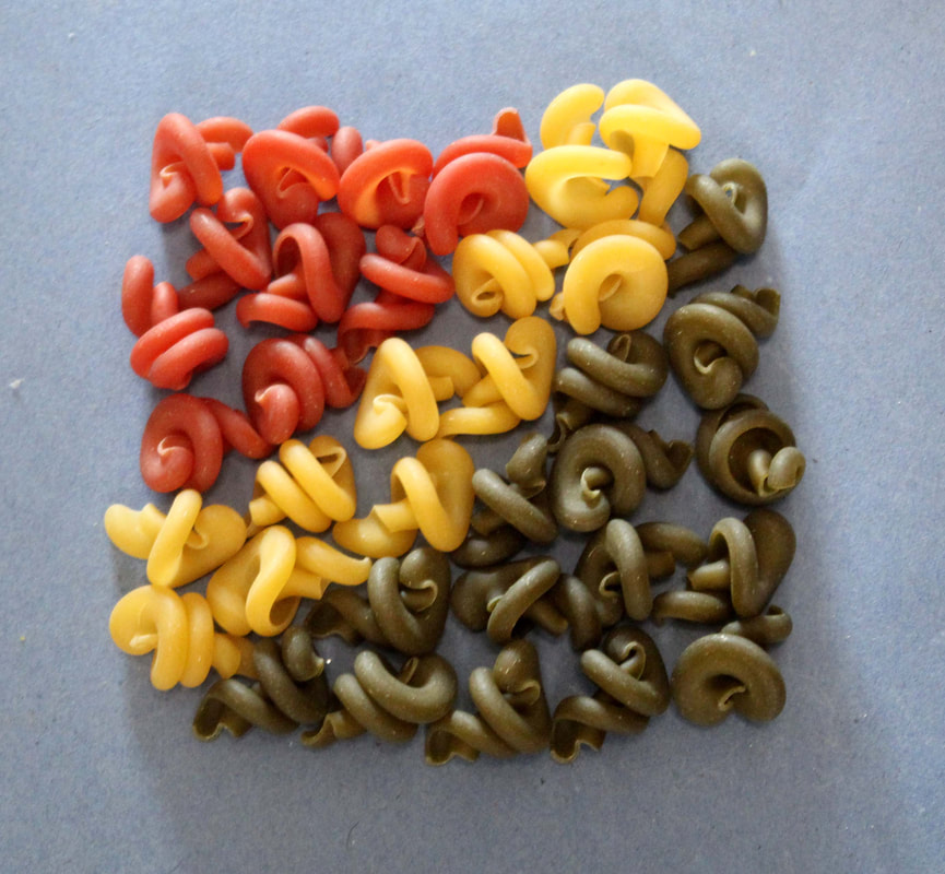
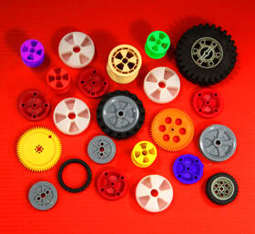
Similar shaped objects
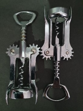
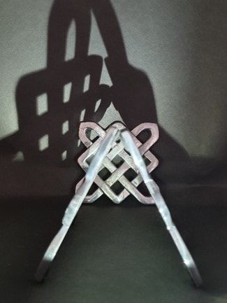
Refining my similar shaped objects
|
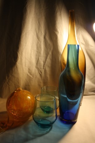
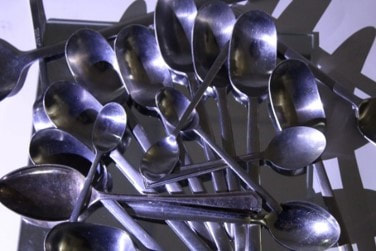
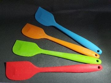
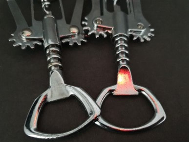
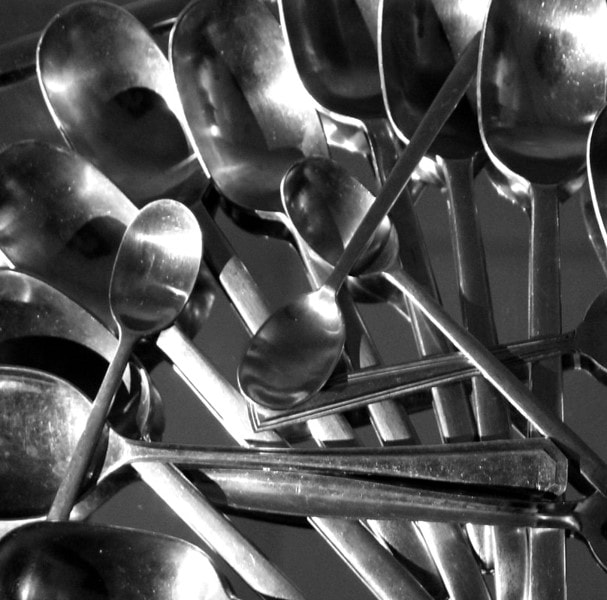
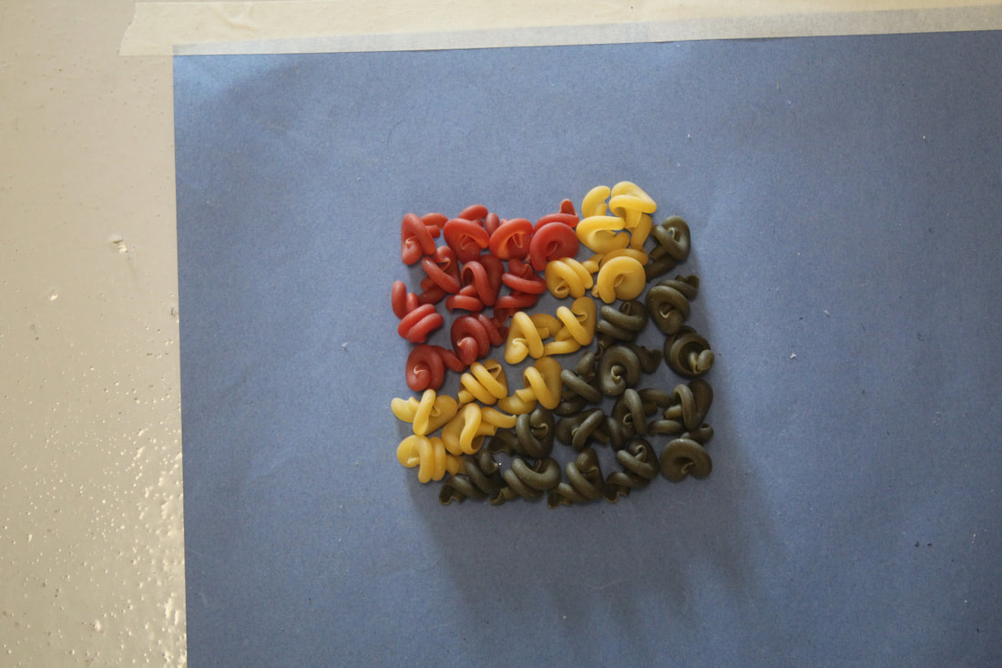
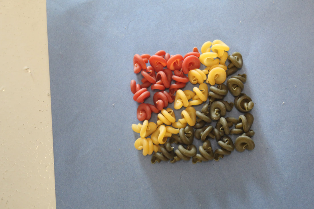
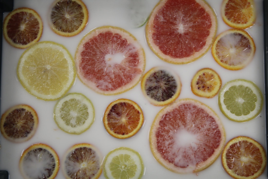
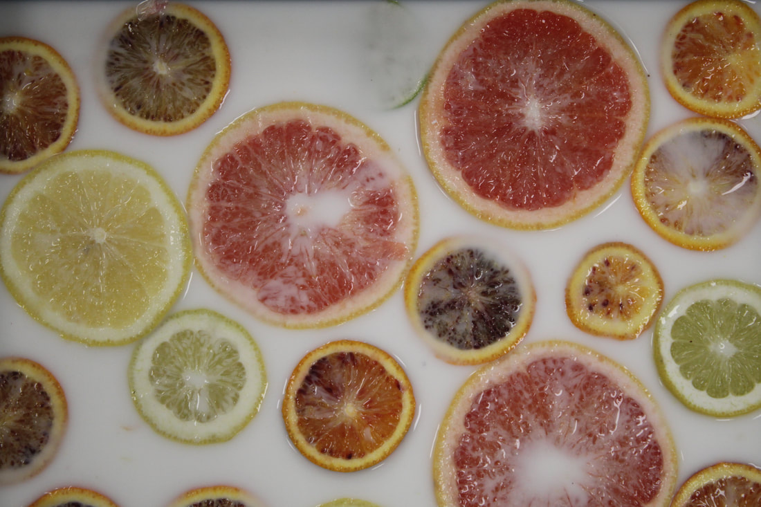
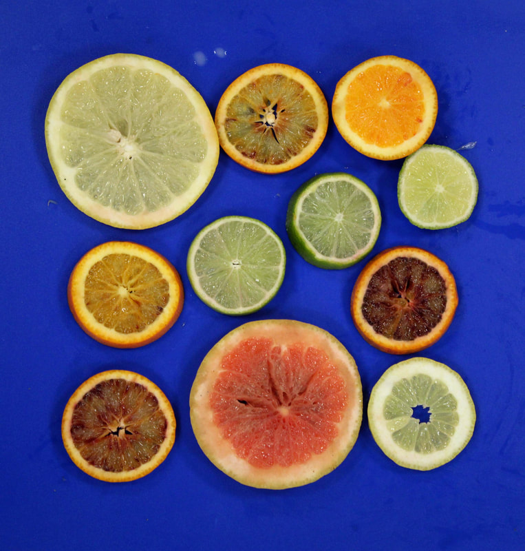
original
|
To edit this photo I have made it black and white, increased the contrast to make it more dramatic. I have also cropped it so that the spoons fill the frame.
|
|
|
|
|
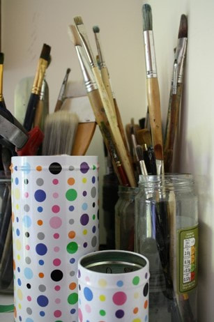
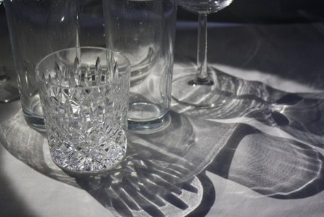
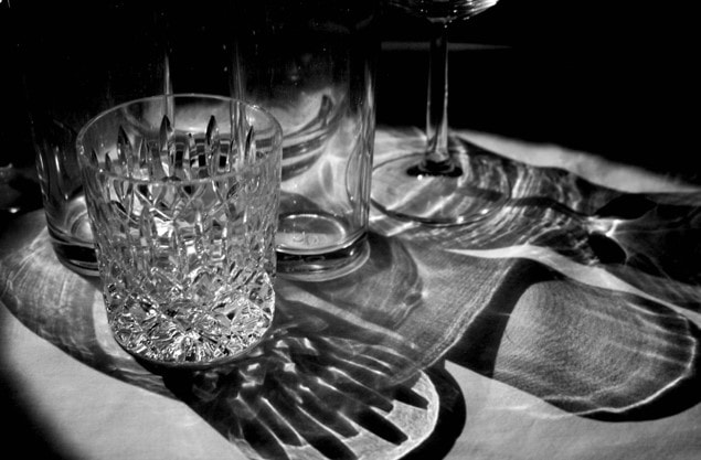
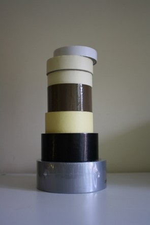
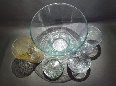
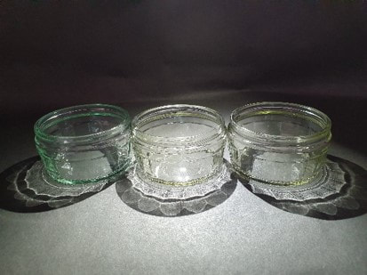
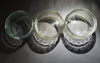
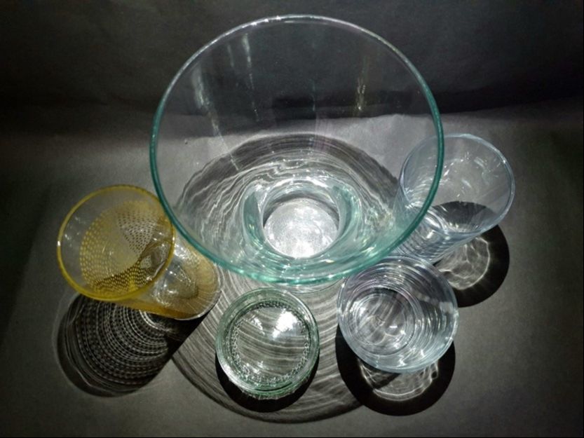
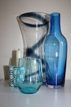
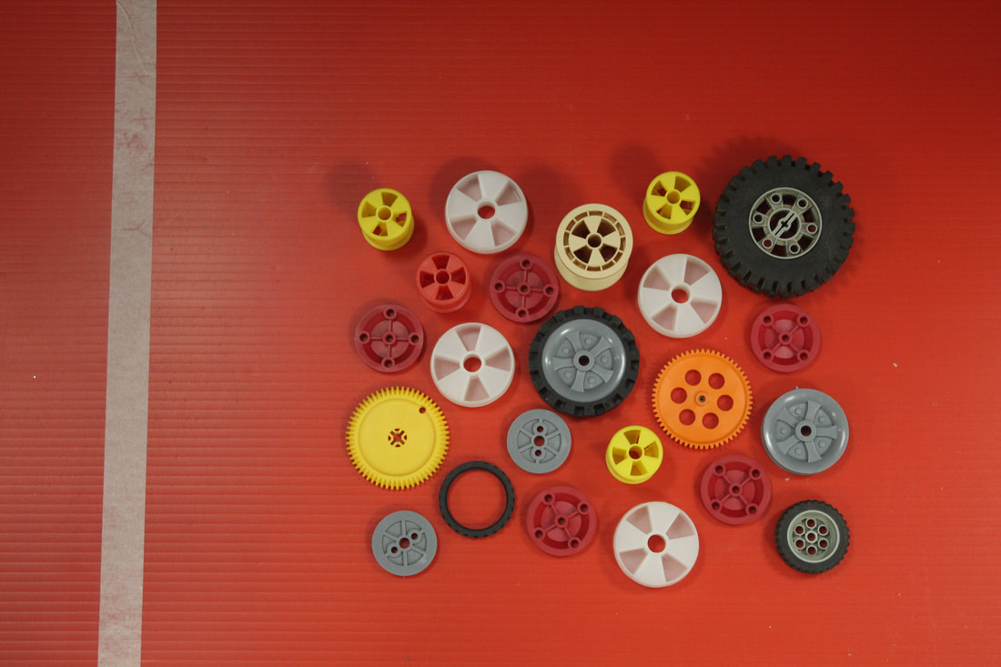
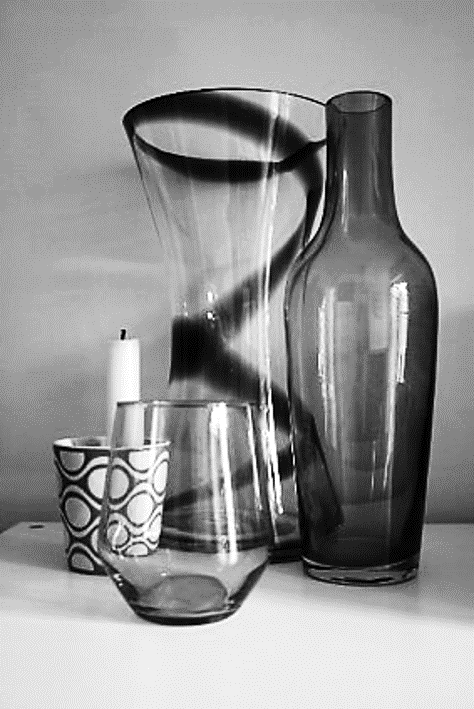
original
|
To edit this photo I have increased the contrast to bring out the shadows and highlights of the glassware. This made the image look a little too bright, so I slightly reduced the brightness.
|
|
|
|
|
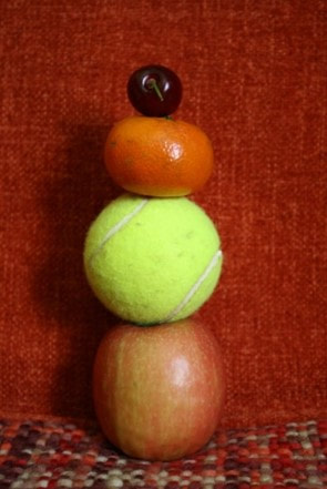
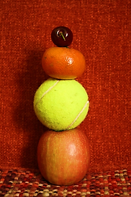
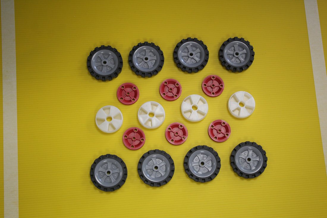
original
|
To edit this photo I have made the colours more saturated to emphasize the round shapes. I have also increased the contrast to give the image more depth.
|
|
|
|
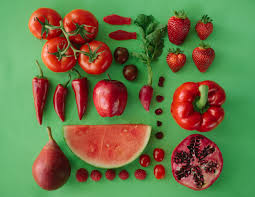
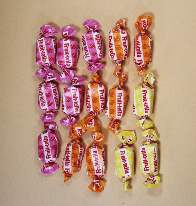
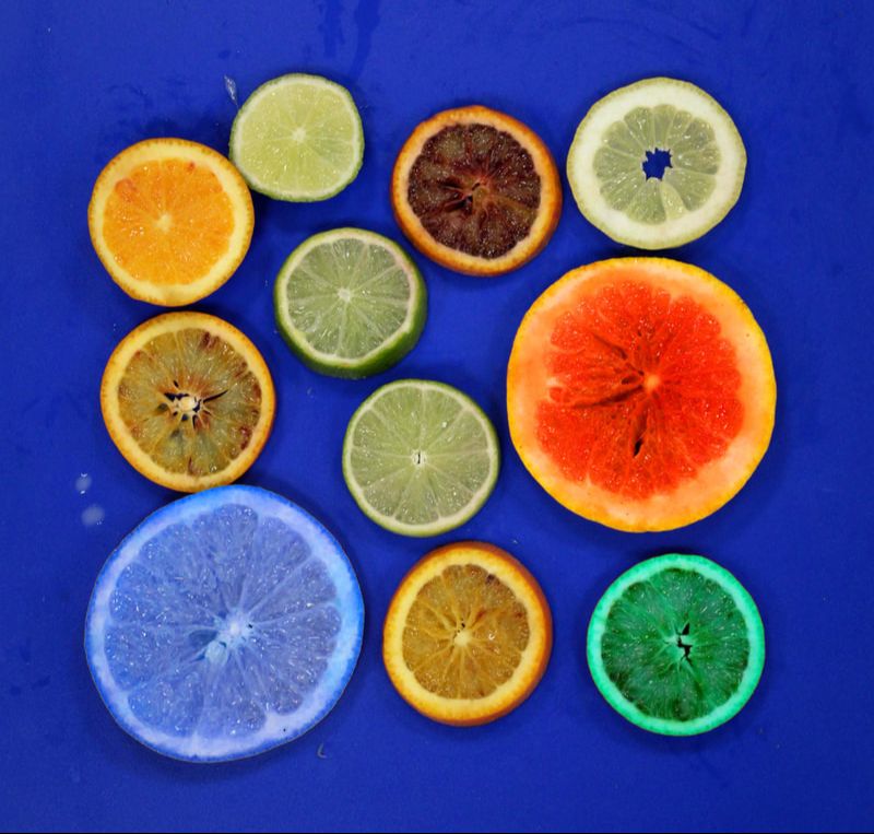
Objects with a colour theme
Refining My objects with a colour theme
|
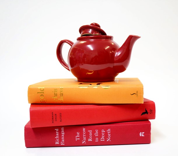
original
|
To edit this photo I have increased the brightness and adjusted the colour to make the photo warmer and fresher. I have also cropped it to make the border equal on all sides.
|
|
|
|
|
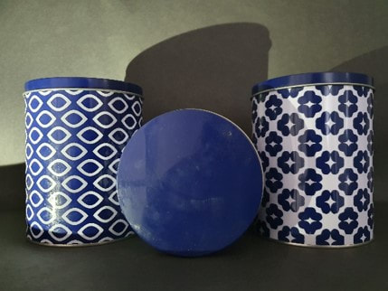
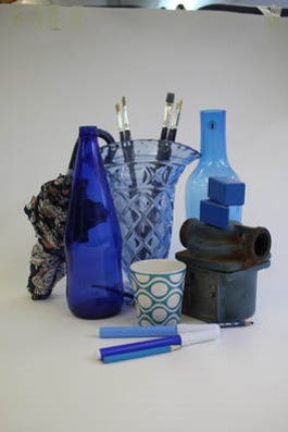
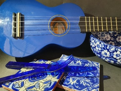
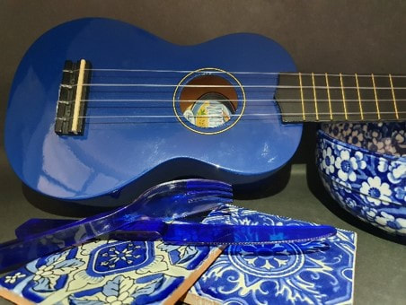
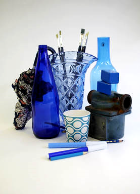
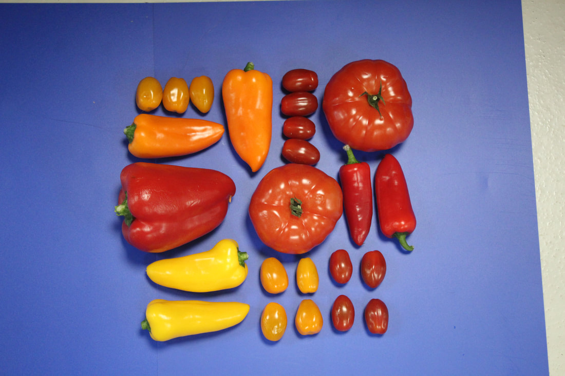
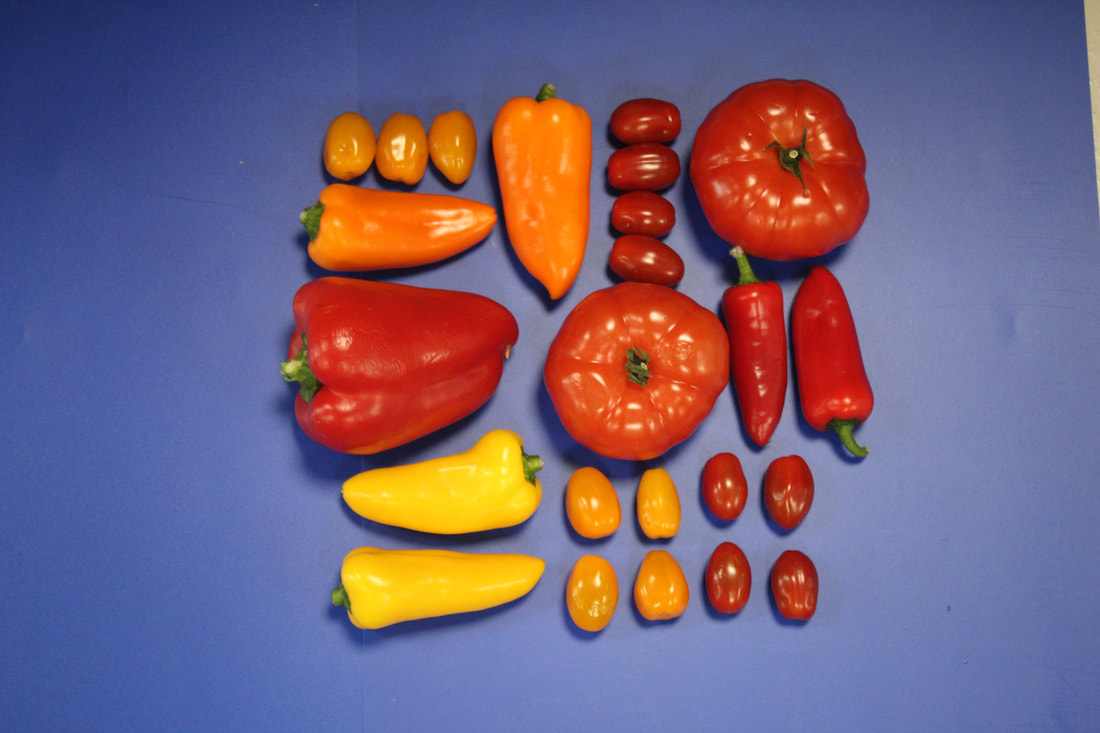
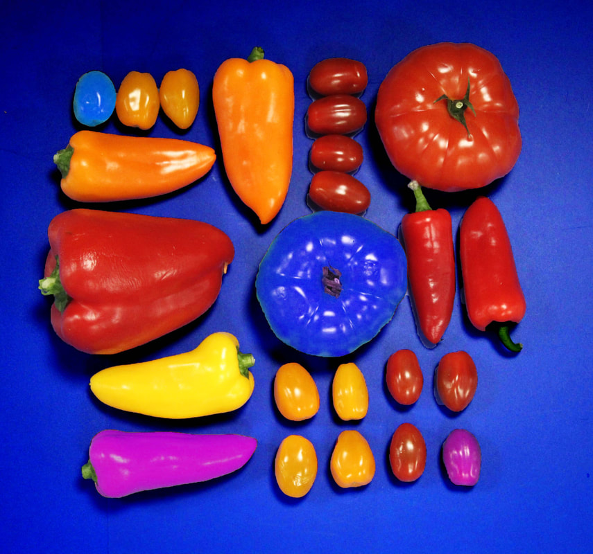
original
|
To edit this photo I cropped the image to remove the part at the top which has the classroom in it, then I used the levels, saturation and brightness tools to deepen some of the colour tones and to brighten others. By doing this it has made the blue tones more vibrant and therefore making them stand out more
|
|
|
|
|
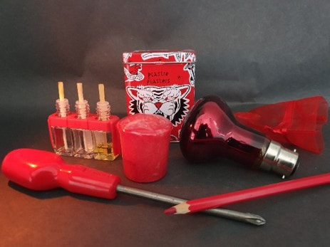
original
|
To edit this photo I adjusted the levels, brightness and saturation to create harsher more vibrant colours. As well as this is makes the background a lot brighter.
|
|
|
|
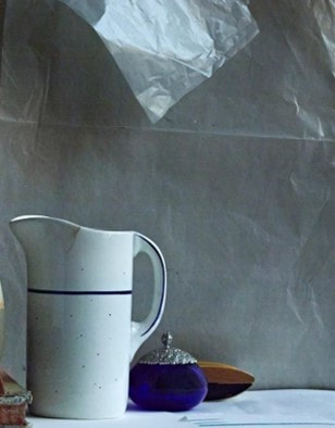
Cropping to vary the composition
|
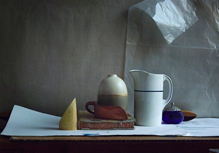
The original photo without cropping
|
|
|
|
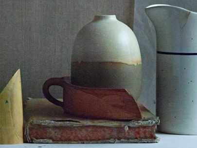
I have cropped to make an asymmetrical composition. I like the blank space above the jug with the triangular shape pointing at the jug.
|
I have cropped in on the layered red section, placing the round vase in the centre.
|
|
|
|
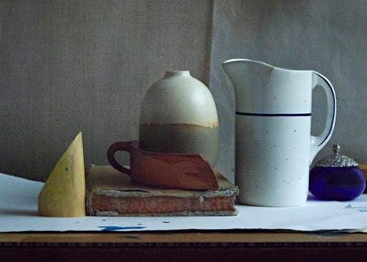
Here, I have cropped in to make a traditional composition with an even border space around the objects.
|
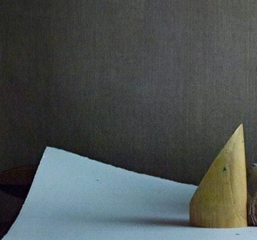
I have cropped in to make a composition that shows shapes and areas of colour only.
|
Emily Blincoe
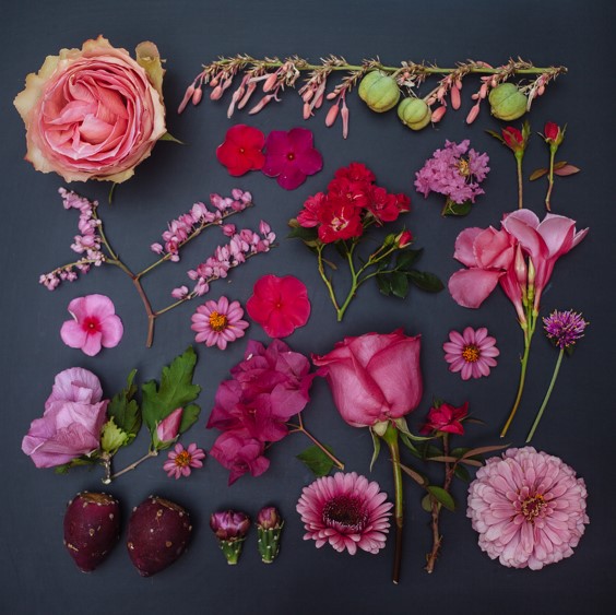
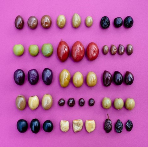
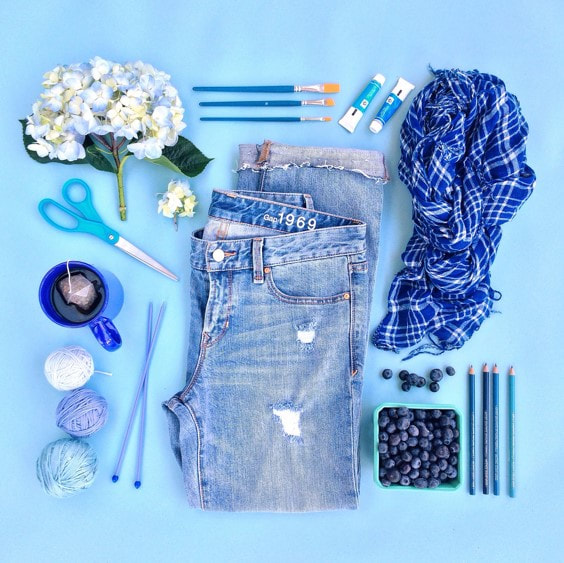
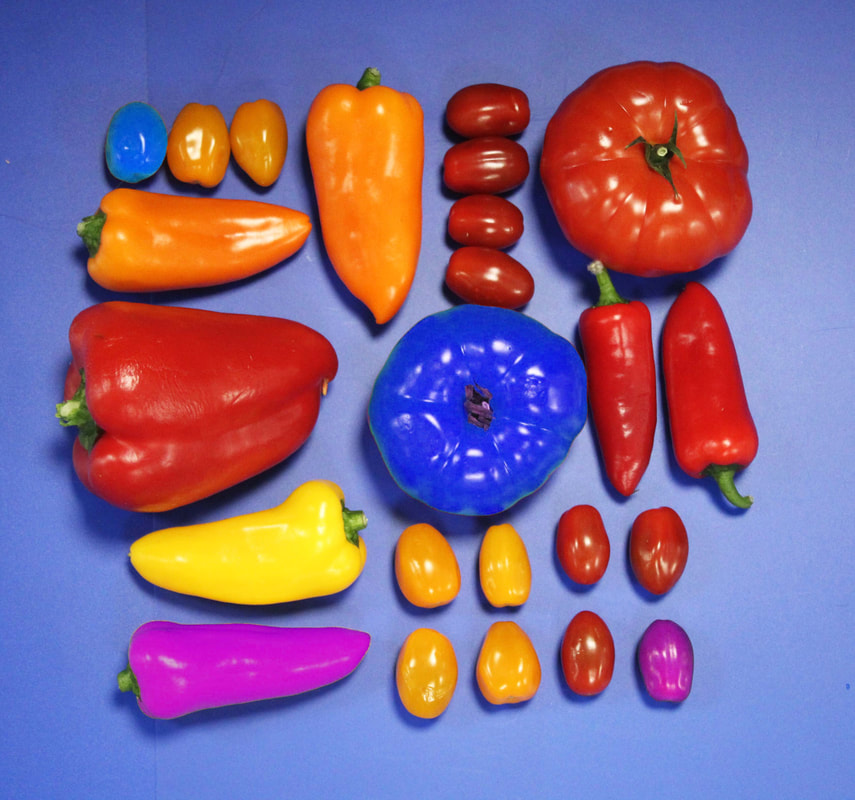
Emily Blincoe is a Photographer from Austin Texas. A lot of her photography work is advertising for companies to promote products or create a brand identity. She is known for her photographs of collections of objects and clever compositions. She creates beautiful, colourful and soothing photos of everyday objects by arranging them into neat and orderly collections based on size, shape and colour. Blincoe arranges her compositions to form a neat external square, but draws viewers into focus on the series of cleverly arranged objects within each composition. She uses a range of different objects to create these compositions, these range from food, plants and flowers to toys, sports equipment and everyday objects like matches and kitchen utensils. I really like her work because the simple and beautiful patterns that she creates are calming, and they also show that beautiful art can be made from just about anything.
Analysing a blincoe photograph
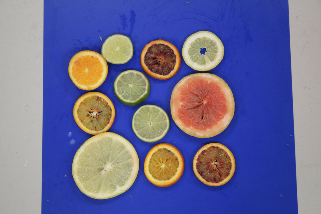
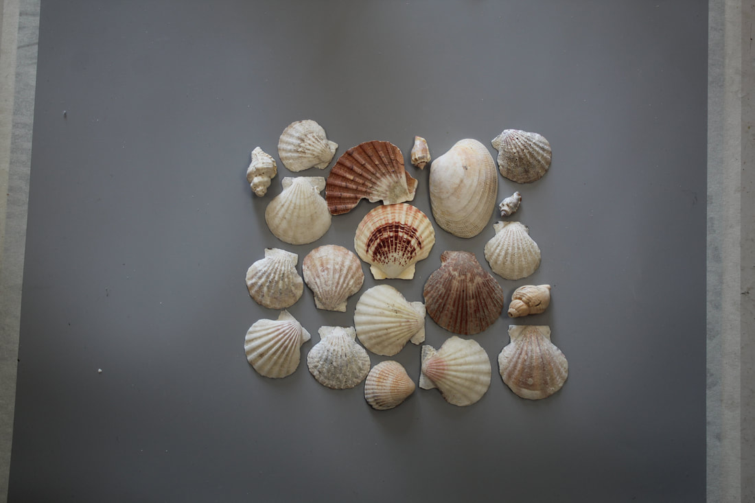
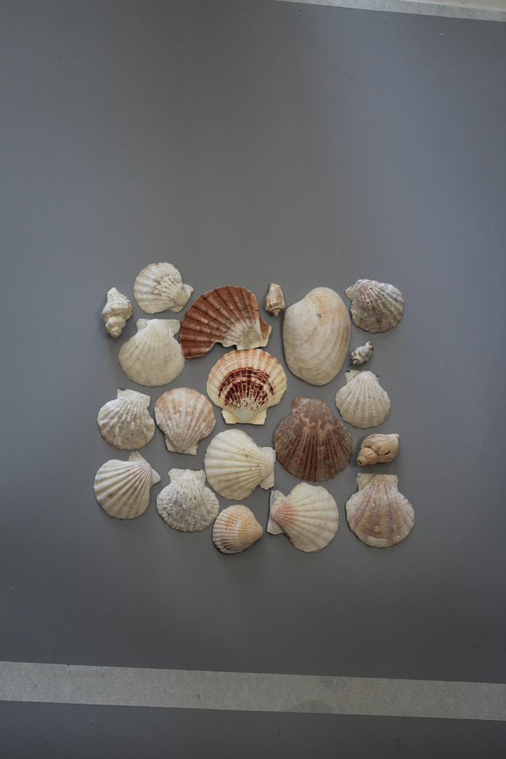
My response to Blincoe
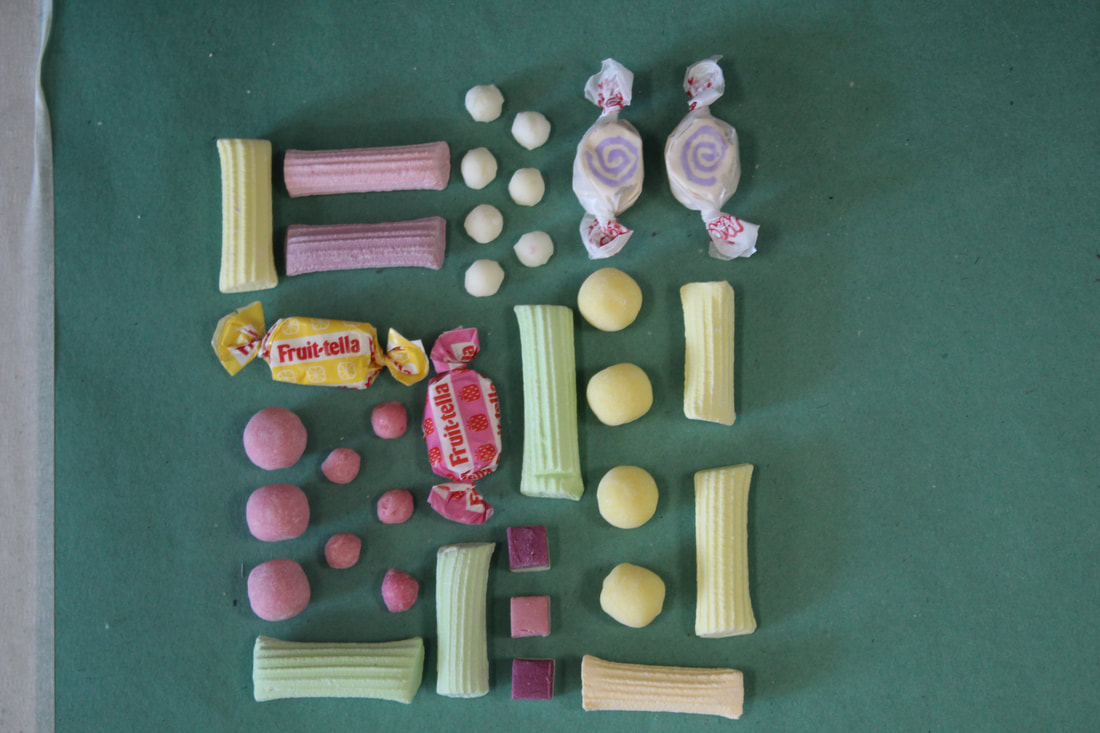
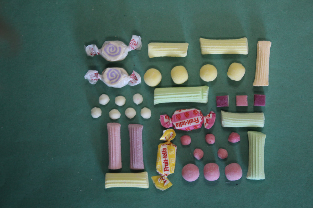
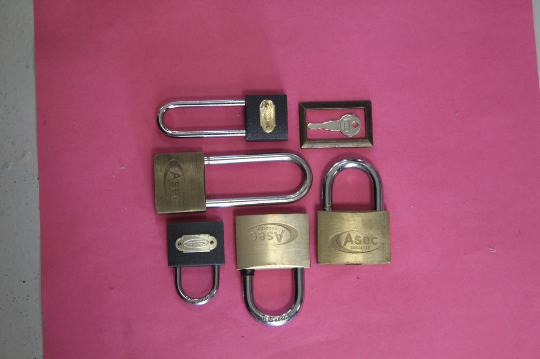
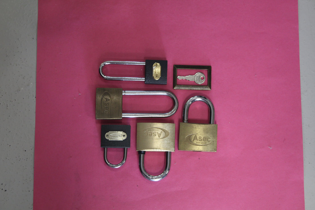
Refining my response to Blincoe.
|
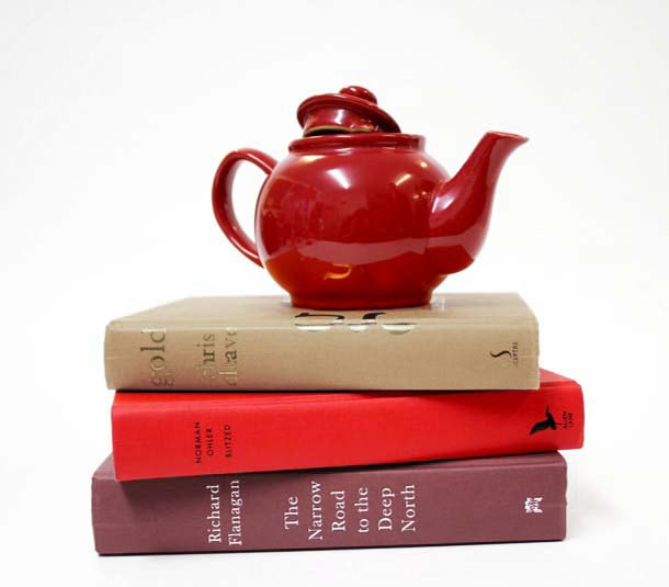
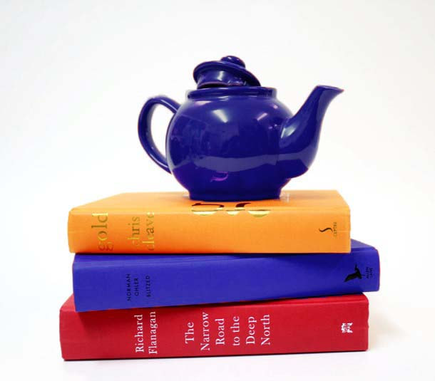
Original
|
To refine my images firstly I have adjusted the composition. To create the square shape with a clear border I have cropped my images leaving an even space around the objects. In order to make the photographs light and neutral in mood, I have adjusted the brightness and contrast slightly making the objects stand out from their backgrounds.
|
|
|
|
|
|
|
|
|
|
|
|
|
|
|
|
|
|
|
|
|
|
|
|
|
|
|
|
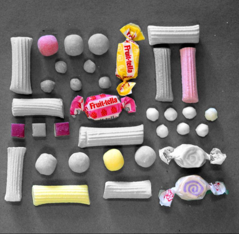
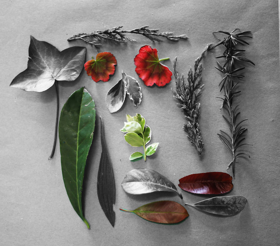
developing my ideas
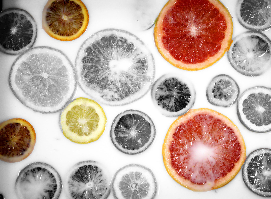
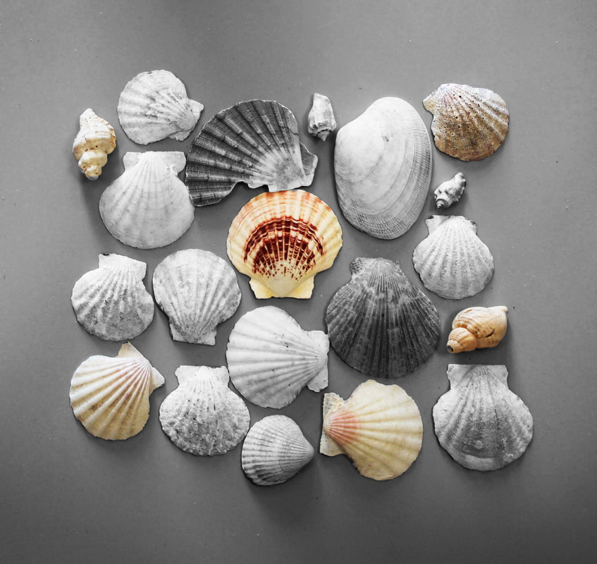
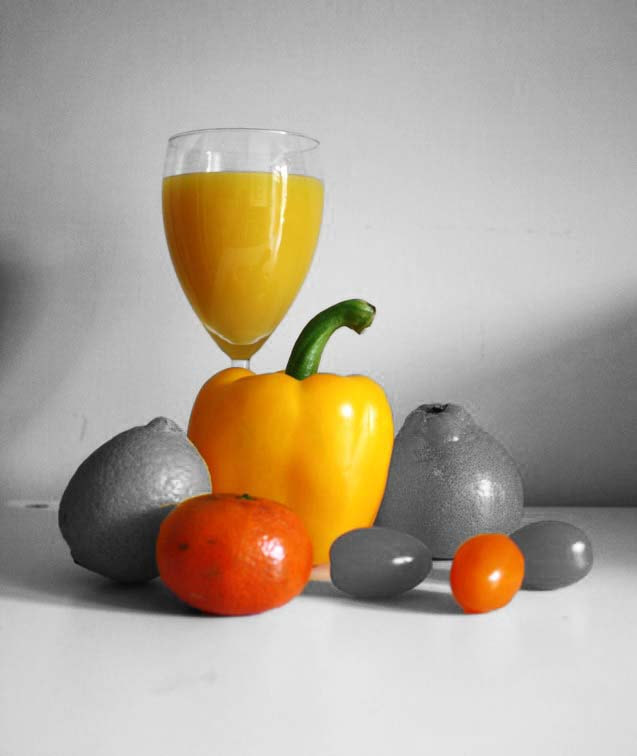
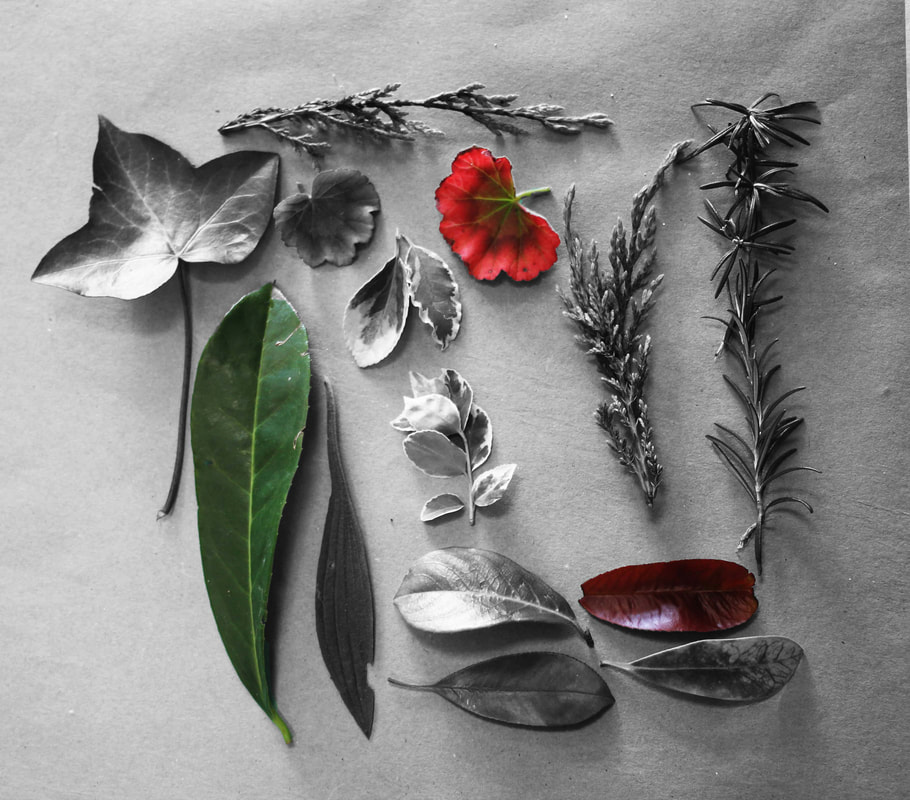
experimenting with isolating colour and black and white
|
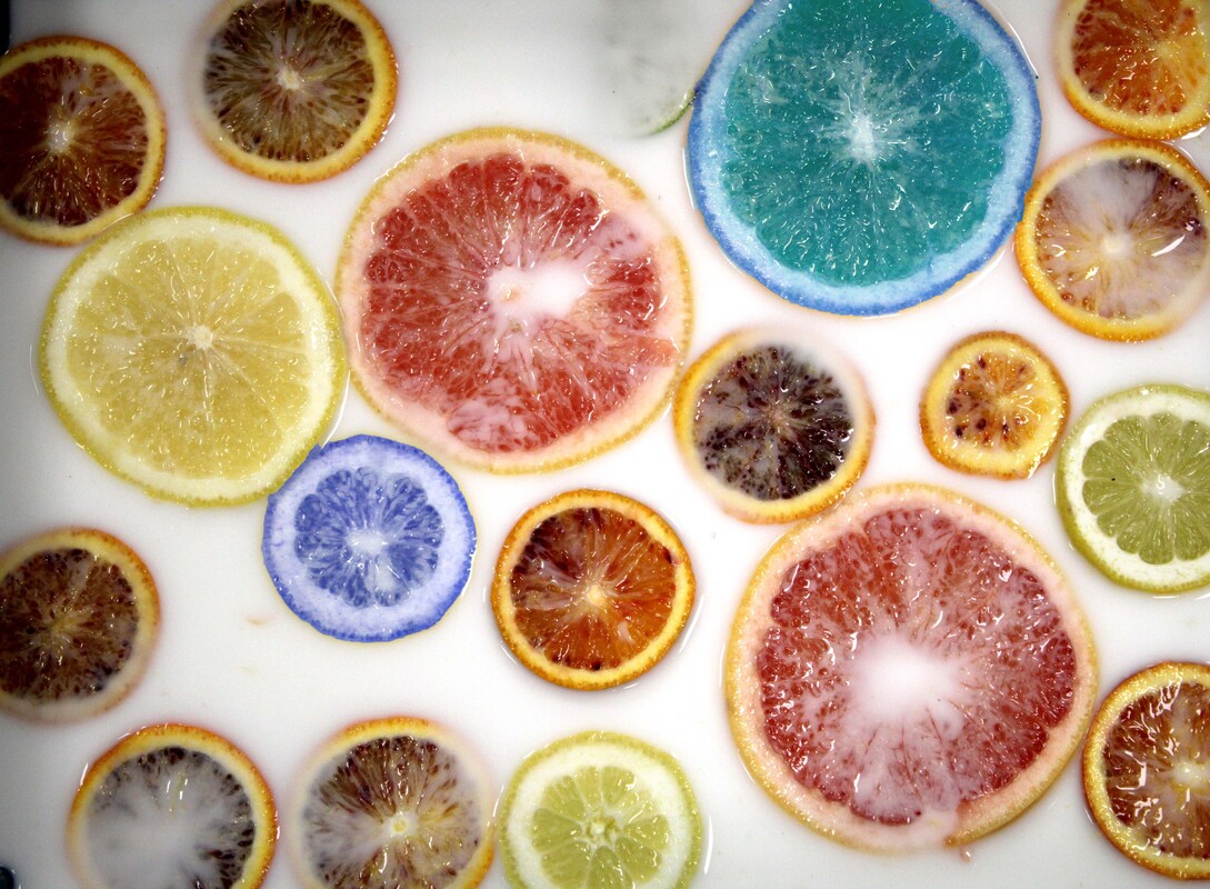
originals
|
To refine these images I have selected areas to change to black and white. This has lefts some objects in colour making them stand out. To balance the images I have made slight adjustments to the brightness, contrast and colour saturation so that the selected areas and the background still work together harmoniously.
|
|
|
|
|
|
|
|
|
|
|
|
|
experimenting with colour selection
|
originals
|
To refine these iames I have selected some of the objects and adjusted the colour hue. This has made certain objects stand out more that others. I still wanted to make the overall effects to be harmonious so I adjusted the brightness and contrast and saturation of colour so that each are was not more dominant that another.
|
|
|
|
|
|
|
|
|
|
|
|
|
|
|
experimenting with triptychs
Looking through this whole project on the theme of Collections I can see some photographs that work well together. I have decided to experiment with photos in groups of three.
Triptych 1
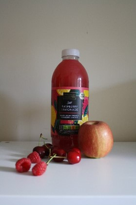
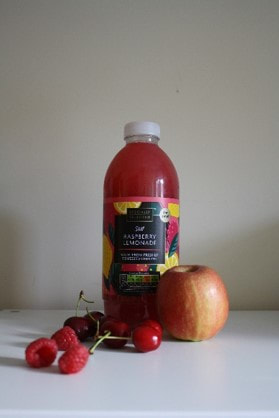
In this set of photos I have chosen a theme of neutral colours and a tall composition.
|
|
|
|
To make this set more similar I have changed the colour temperature to be warmer. I also moved the photos with a tower composition to the sides leaving the image with less structure in the centre.
|
|
|
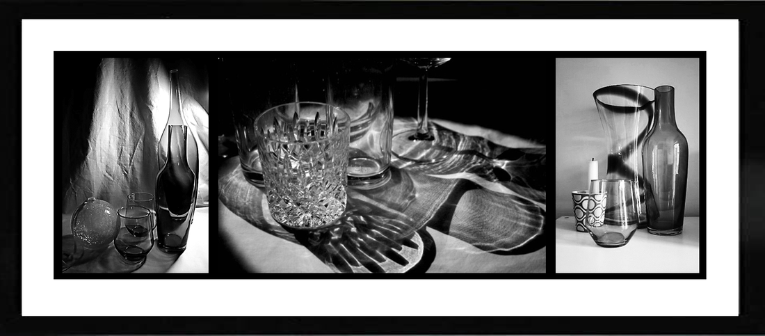
Triptych 2
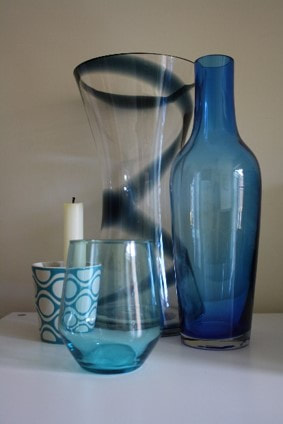
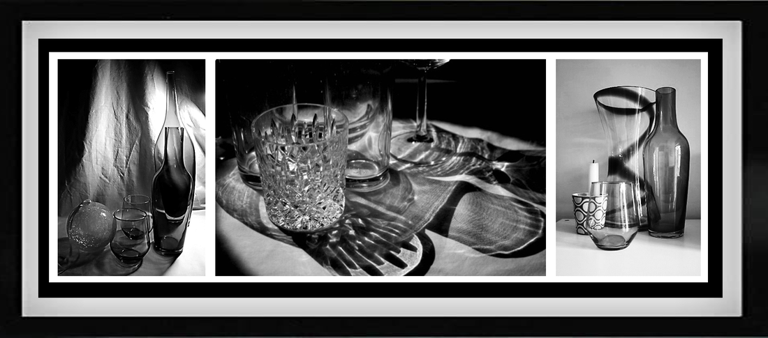
In this set of photos I have chosen a theme of transparency.
|
|
|
|
To make this set work together I am going to edit them all to be black and white and high contrast.
|

|
|
triptych 3
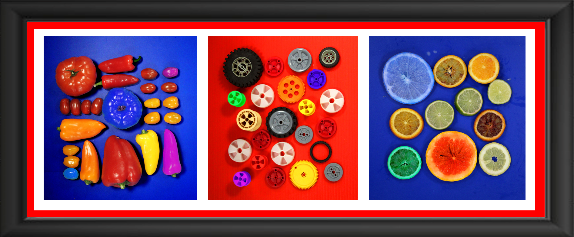
In this set of photos I have chosen the theme of bright colours, a square composition with many round objects.
|
|
|
|
To make these photos work together I have adjusted the saturation of colour so they are all very bright. I have also selected some objects to change into alternative bright colours.
|
|
|
triptych 4
In this set of photos I have chosen images that are arranged in a square composition with small objects in a pattern
|
|
|
|
To make these images work together I have cropped them to a square shape. I have also edited them to have a selection of objects in colour and the background in black and white
|
|
|
Experimenting with coloured backgrounds and frames
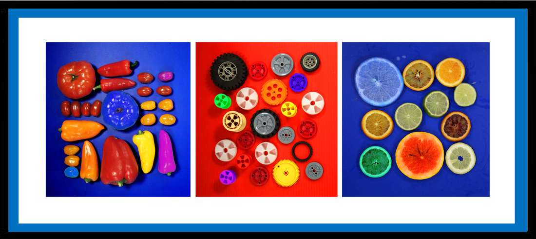
Triptych 1
In this experiment I have used a red border together with a deep black frame. I like the way the red matches the red on the photos but I feel that the photos are not dominant enough so I will rey another colour border.
Here I have picked a softer blue for the border. I feel this colour compliments the photos without dominating. I prefer the slimmer black frame.
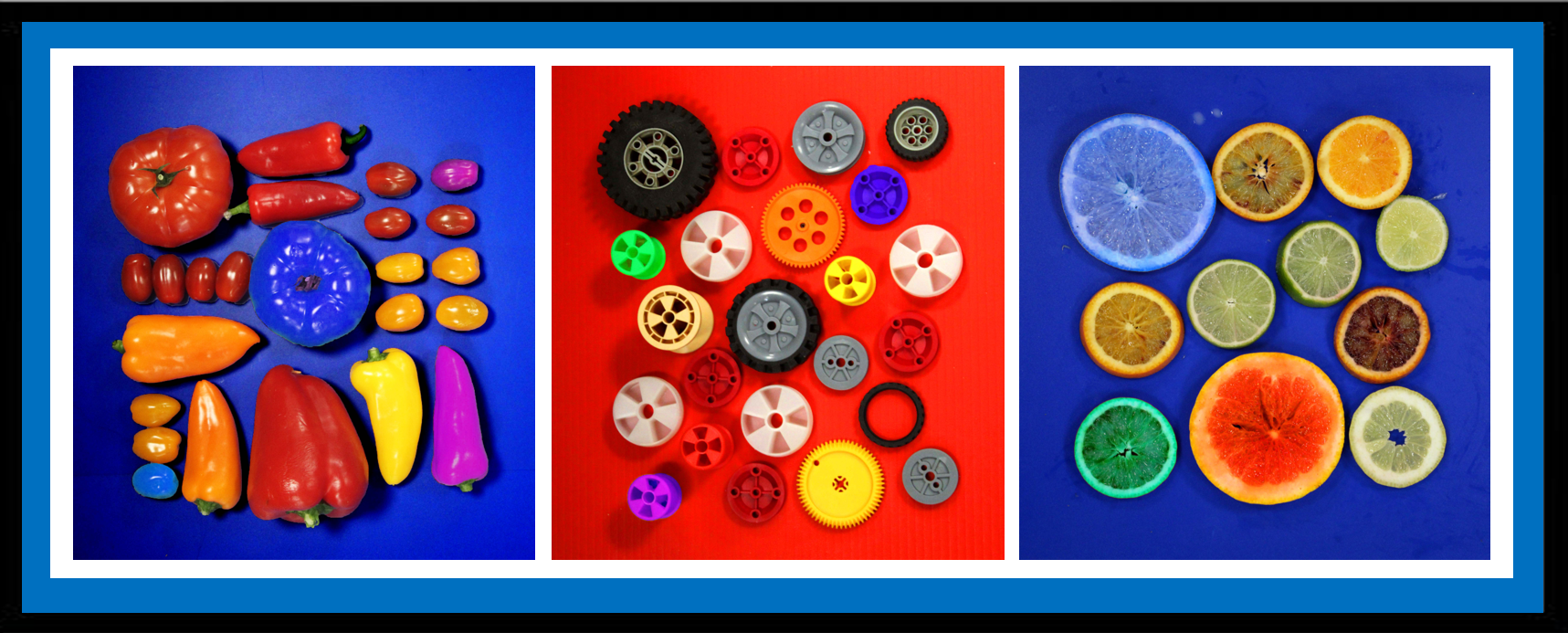
To make the photos stand out more I have increased the white border size. Putting space between the photos and the frame makes the photos more dominant.
Triptych 2
To compliment this set of photos I have used black, white and grey borders. I think the black frame suits the photos well, but I think the framing is a little busy.
Here, I prefer the simpler framing allowing the photos to stand out more.
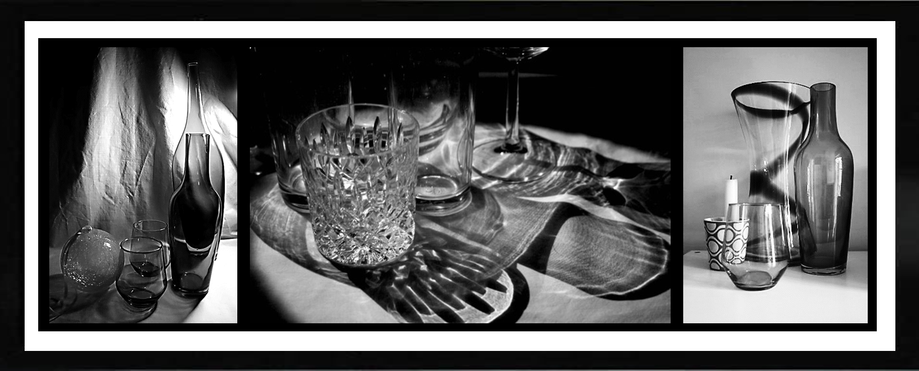
Keeping the simpler frame, I have increased the border size to give more room to the photos, making them more dominant.
My final pieces
evaluation
I began this project by researching the theme of Collections. I particularly responded to the work of Emily Blincoe. Her images are imaginative and skilful and I was keen to explore how to she used colour, borders and pattern to create interesting collections of objects. I have explored a range of media, processes and techniques in this project including composition, lighting and digital manipulation. I have refined my work in various ways. For example I have increased the brightness and contrast of my images. In addition, I have changed colours and made some parts black and white. I found the technique of isolating colour very challenging and it took me a long time and plenty of patience to make real progress.
I am pleased with my final outcomes because they represent how I feel about the theme of Collections. I have chosen to display them in a particular way because I wanted 3 photos to be seen as a set with a complimentary frame. If I had more time I would like to explore the theme of Collections in even more detail by using a greater variety of patterns and objects.
I am pleased with my final outcomes because they represent how I feel about the theme of Collections. I have chosen to display them in a particular way because I wanted 3 photos to be seen as a set with a complimentary frame. If I had more time I would like to explore the theme of Collections in even more detail by using a greater variety of patterns and objects.